RIT Degree Tracker
This case study highlights the importance of user-centered design
in improving the website's effectiveness and usability, by simplifying the site's structure after addressing the pain points of users and optimizing it for mobile devices

As part of the Information & Interaction Design course at Rochester Institute of Technology, I collaborated with four other UX designers to reimagine the university’s Student Information System (SIS). Our goal was to address usability issues faced by students while navigating degree requirements and academic records
As part of the Information & Interaction Design course at Rochester Institute of Technology, I collaborated with four other UX designers to reimagine the university’s Student Information System (SIS). Our goal was to address usability issues faced by students while navigating degree requirements and academic records
EdTech
EdTech
Rochester Institute of Technology
Rochester Institute of Technology
2022
2022
Problem Statement
RIT students struggle to monitor their degree progress in the Student Information System (SIS), making the the process cumbersome, confusing, and time-consuming.
Problem Statement
RIT students struggle to monitor their degree progress in the Student Information System (SIS), making the the process cumbersome, confusing, and time-consuming.
Objective
The objective was to improve the usability and overall experience of RIT's SIS by simplifying how students track their degree progress and academic information.
Objective
The objective was to improve the usability and overall experience of RIT's SIS by simplifying how students track their degree progress and academic information.
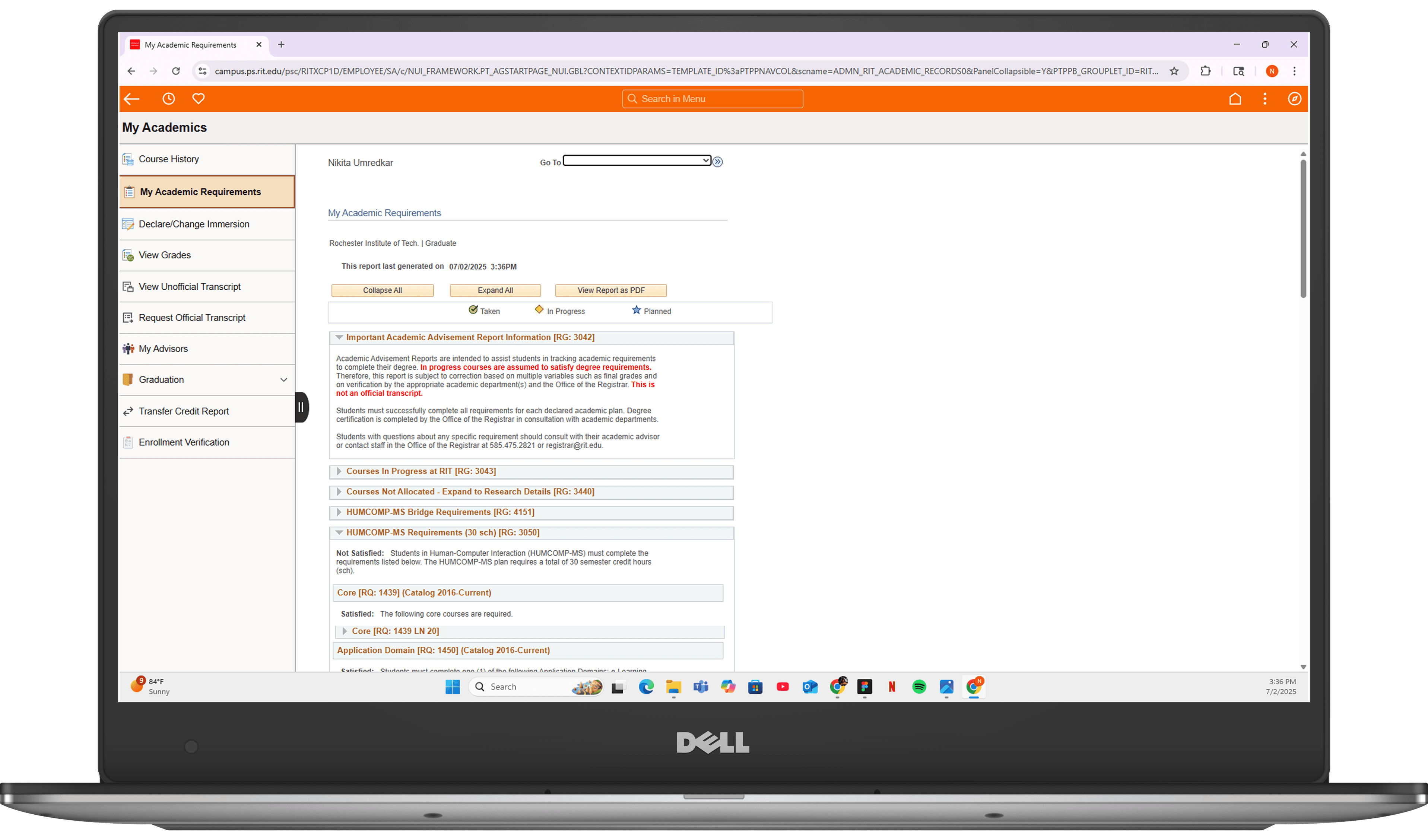
Current UI of SIS
Current UI of SIS
Desktop Version
Evaluate navigation & findability of key checkout elements.
Mobile Version
Assess information clarity around reports, pricing, and plans.

The Challenge
What do Users struggle with?
Problem 1
Difficulty registering classes
Evaluate navigation & findability of key checkout elements.
Problem 2
Complexity in viewing Course requirements
Assess information clarity around reports, pricing, and plans.
Problem 3
Lack of Visualizations
Identify friction in the checkout process.


Proposed Solution
Show Progress
An interactive dashboard for straightforward degree progress monitoring. To track degree and offer elective course suggestions for future requirements.
Evaluate navigation & findability of key checkout elements.
Visualize
The information in an intuitive format for easy comprehension after extracting data from student records for past courses, credits, grades, current enrollments, and future requirements.
Evaluate navigation & findability of key checkout elements.
Highlight
Key milestones and provide timely alerts.
Evaluate navigation & findability of key checkout elements.
Research & Discovery
The Team's Process
Our team interviewed 10 participants over 2 weeks to evaluate the need for an improved SIS. We documented and analyzed their responses, created charts, and developed an affinity diagram in Miro.
This process helped us understand users' experiences and pain points with the current SIS and gather their feedback. By examining their grievances and suggestions, we gained valuable insights to inform the design of a new interface.
10 Participant Profiles
Full time RIT students
Evaluate navigation & findability of key checkout elements.
10 User Interviews
15 minute interviews
Assess information clarity around reports, pricing, and plans.
5 Contextual Inquiry
Studies over 2 weeks
Identify friction in the checkout process.
Summary of Interview Findings
Affinity Diagram
Design & Prototyping
From Wireframes to High-Fidelity
Low Fidelity:
High Fidelity:
The final design is a responsive web and mobile-optimized solution that provides a clear, intuitive, and visually engaging experience for all RIT Kronos users
The final design is a responsive web and mobile-optimized solution that provides a clear, intuitive, and visually engaging experience for all RIT Kronos users
Desktop Version
Evaluate navigation & findability of key checkout elements.
Mobile Version
Evaluate navigation & findability of key checkout elements.
Validation & Iteration
Testing the Solution
The high-fidelity prototype was validated through task-based usability testing, where participants used the think-aloud protocol to provide real-time feedback. The goal was to measure whether the new design effectively addressed the identified usability challenges.
Key Finding: During initial testing, users understood the circular gauge for the pay period but wanted a quicker way to see their progress for the current week
Iteration: Based on this feedback, I added the weekly bar graph to the dashboard. This "before and after" change provided users with both a micro (daily/weekly) and macro (pay period) view of their hours instantly.
Solution & Results
Test results are under NDA
Solution & Results
Test results are under NDA
Task Completion
& Performance
Our team interviewed 5 graduate students from RIT and had them complete three different scenarios in out prototype design and our current SIS system.
The tasks encompassed questions like
Checking the student's GPA,
Identifying the number of remaining courses, and
Reviewing course schedules.
Solution & Results
Test results are under NDA
Solution & Results
Test results are under NDA
After completing the tasks on the current SIS website and prototype, we had our participants take a post questionnaire. In the questionnaire, we asked them to rate the importance of the tasks they completed in the session.
3 of them viewed seeing how many courses they had left as very important and 2 of them viewing that task as important.
In regards to finding a student's GPA, 1 user found that task very important, 2 users found it important, while the other 2 users found it neutral and not important.
Solution & Results
Test results are under NDA
Solution & Results
Test results are under NDA
Results
Video Walkthrough
Solution & Results
Test results are under NDA
Solution & Results
Test results are under NDA
Learnings, Takeaways & Further Research
Our prototype was unanimously preferred over the old SIS and scored much higher on the SUS evaluation. Limitations were the small sample size of only RIT graduate students, which may bias results towards the familiar SIS system. Further iterations incorporating user feedback are recommended before development, along with expanding testing to more diverse users beyond RIT undergrads and grads.
References:
Affairs, A. S. for P. (2013, September 6). System usability scale (SUS). Usability.gov. Retrieved December 2, 2022, from