

ULTIMATE KRONOS GROUP
SPONSORED PROJECT
Solving workforce management compliance challenges
to boost user satisfaction by 62%
OUTCOMES AT A GLANCE
2.4x
Faster workflows for users
87
System Usability Score
40%
Boost in task Completion Rate
VIEW PROTOTYPE
Click here to view the prototype.
Introduction
CONTEXT
This case-study is about RIT's Kronos Workforce Management System, a product by UKG (Ultimate Kronos Group) with 3000+ users across campus.
DURATION
Sept' 24 - May'25
ROLE
UX Designer (Me)
UX Researcher
Project Manager
Capstone Advisor
RESPONSIBILITIES
Product Strategy
Market Research
Visual & Interaction Design
UX Workshops & User Testing
Process
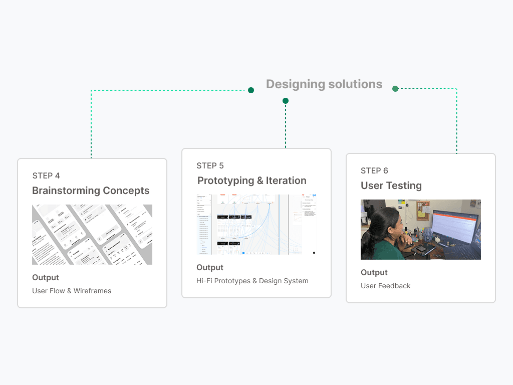
THE DESIGN PROCESS
A rigorous, research-driven approach combining heuristic evaluation, mixed-methods user research, and iterative prototyping was adopted.

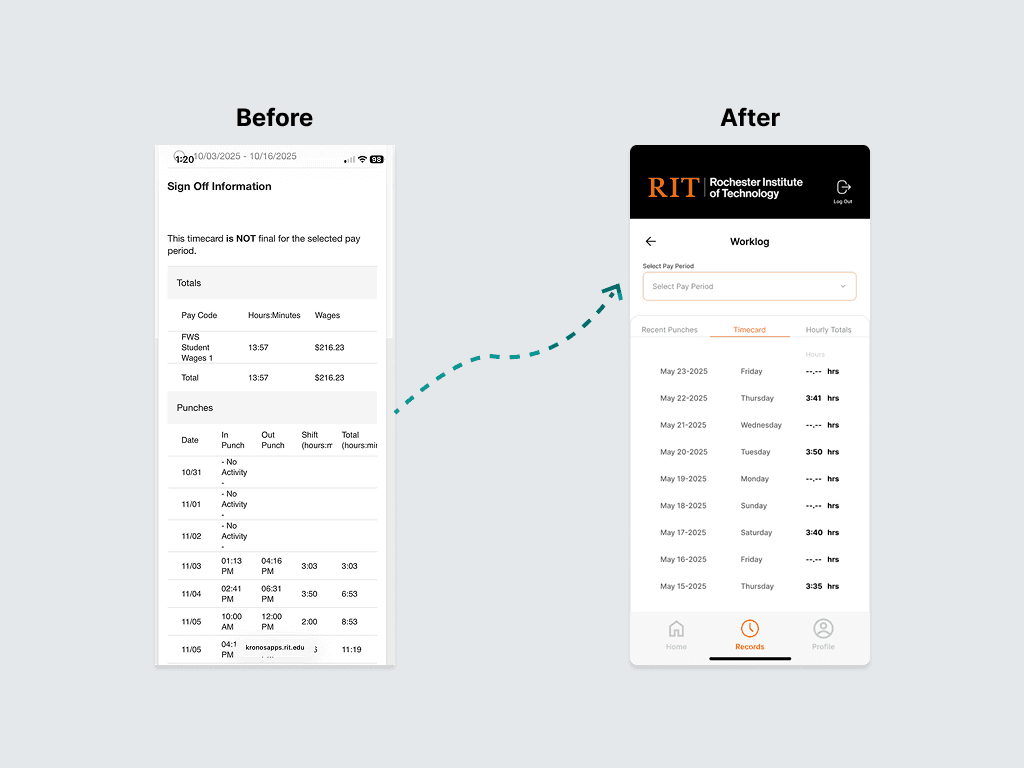
THE LEGACY CHALLENGE
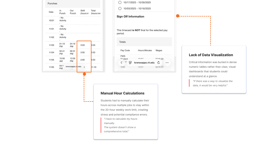
Student workers on campus juggling multiple on-campus jobs faced manual calculations, confusing terminology, and poor mobile experiences—leading to compliance anxiety and low adoption.
Here's how my process helped solve problems with RIT's Kronos System
DESIGN GOAL
After conducting heuristic evaluations, surveys, and contextual interviews with 10 participants, three key design opportunities emerged
01
Streamline Multi-Job Tracking
Show cumulative hours & compliance status across all jobs in a single, visual dashboard
02
Enhance Data Comprehension
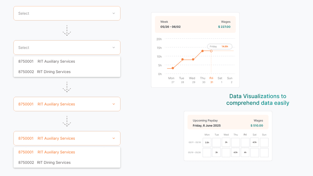
Visualize timecards, earnings, and pay cycles through intuitive charts and cards, reducing the need for manual calculations.
03
Increase Task Completion Rates
Simplify navigation and surface primary actions upfront, allowing users to complete core tasks like clock-in/out or job switching in fewer steps.
USER PAIN POINTS
Insights from user research

How might we make Kronos fast, intuitive & user friendly?
GRANULAR DESIGN DECISION #1
Branded Login Experience
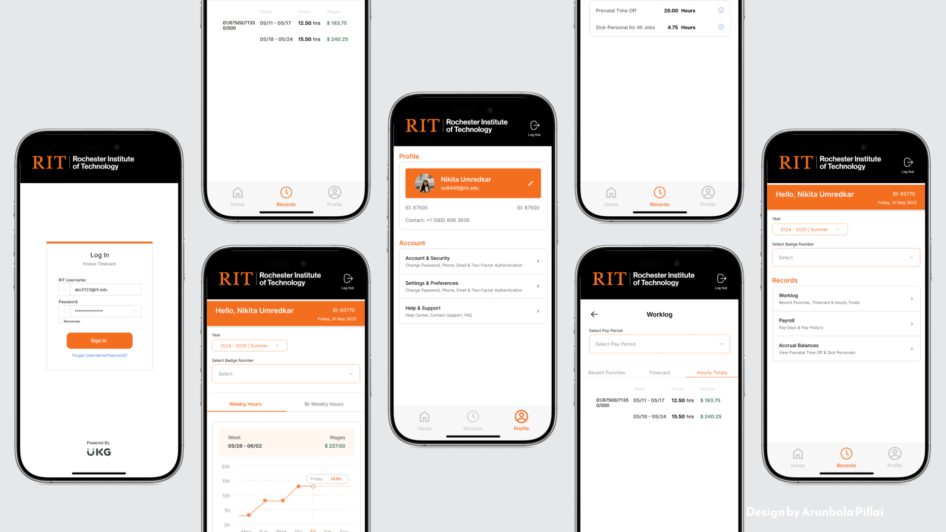
Created a welcoming first impression by unifying RIT's visual identity with Kronos, building trust and familiarity from the moment students log in.

GRANULAR DESIGN DECISION #2
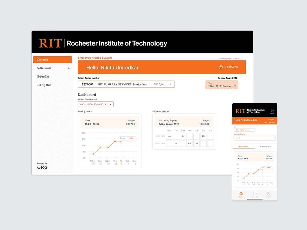
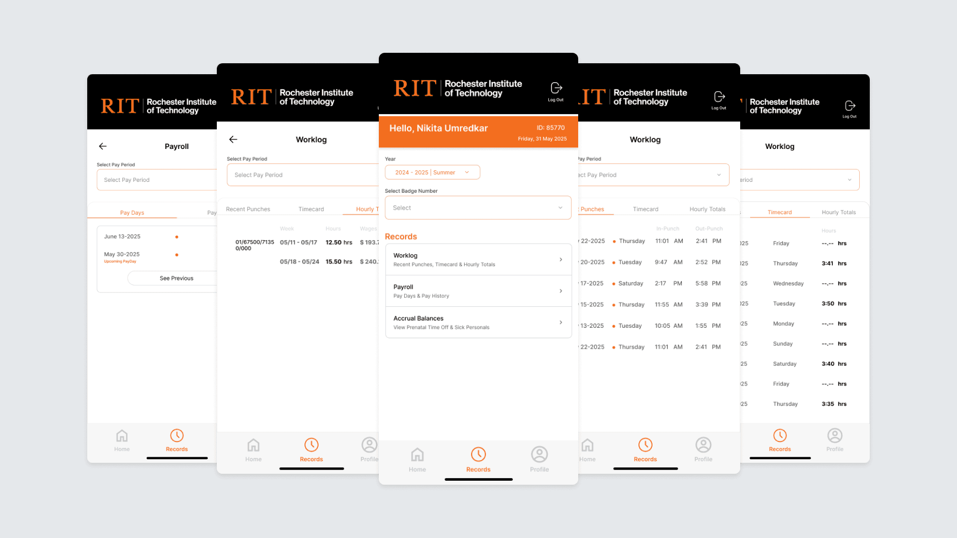
Dashboard
Card-based dashboard showing total hours, progress toward 20-hour limit, upcoming paydays, and quick actions for clocking in/out—everything students need at a glance.

GRANULAR DESIGN DECISION #3
Visual Design Improvement
Intuitive dropdown for switching between roles and viewing corresponding timecards, making compliance tracking effortless for students with multiple campus jobs.
Final Designs
After what felt like a 1000th iteration…
USER TESTING
In a total of 5 user testing sessions, these were the 3 key takeaways:
4/5 Users found the redesigned config module as more intuitive
Users liked the clean and modern product appeal of the redesign
Users suggested that the dashboards could have been personalized

PROJECT TAKEAWAYS
01
Solving industry level problems requires planning and time
Designing an impactful solution for a real-world business problem needed a timeline and planning that allowed for flexibility, challenges and adjustments as needed.
02
Taking ownership elevated the project experience
By taking initiative of core processes, I negotiated design solutions with the team that ensured positive outcomes
03
Designing for flexibility & Scalability in future
Redesign was implemented with a forward-thinking approach minimizing costly redesigns and easy expansion of features